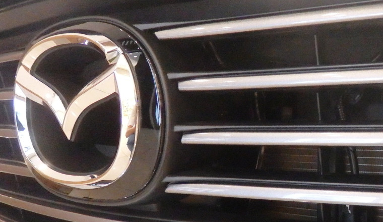
The 1999 Mazda MX-5 makes a great anniversary present, as it marked the Miata's 10th birthday and brought some subtle but welcome changes over first-gen models. The 1999 Miata said goodbye to popup headlights and hello to a bit more output, for example, and the company also slapped its new logo on the car's exterior. Actually introduced for the first time the year before — in 1997, because the '99 Miata came out in '98 — the fresh logo featured a stylized "M" in a circle, with the letter's angled parts massaged to look like two wings, and the verticals provided by the curves of the circle.
Nor were those wings just meant to look cool. Mazda says they represent the company's "drive to pursue improvements and continuous growth with flexible thinking, creativity and resilience."
And they continue to appear on a recently trademarked Mazda logo that could represent the next phase in the design's evolution. The updates are fairly slight and are centered around the wings, which are now less wing-like with straighter lines. The circular frame has been squished down somewhat as well. To be clear, Mazda's trademark was for Japan, but a similar logo has already been shown in China, on the Mazda Arata SUV concept. So it's unlikely to be limited to Mazda's home country. And while the future of the logo is still unsettled, let's take a quick look at its past.
 Art Konovalov/Shutterstock
Mazda traces its roots back to 1920, when Toyo Cork Kogyo Co. Ltd. was founded in Hiroshima, Japan. As you might guess, it made cork products, which, yes, was a far cry from building a bona fide luxury SUV today. But among its early board members was an engineer named Jujiro Matsuda, who was more interested in machinery than cork. He became president of the company in 1921, eventually transforming it into the automaker we know today.
Before then, the company used a logo that was a thick red circle with two short horizontal lines going across its center, not quite touching in the middle. Again per Mazda, this reflected "Toyo Kogyo's desire to contribute to the world through engineering and the determination to constantly strive forwards." "Cork" was dropped from the company name in 1927, and it transitioned to producing its first three-wheeled vehicle in 1931. The debut of the "Mazda" moniker and logo — the name in a fancy font — followed in 1934.
It wasn't until 1959, that the automaker designed a logo for an actual car. Which is because the first actual Mazda car didn't come along until the 1960 Mazda 360 kei car. It showed off a chrome circle enclosing a small "m" that, in turn, was attached to the circle by extending the letter's outside lines.
 Sergey Kohl/Shutterstock
Mazda has adjusted the look of its logo over the years, with one of the more interesting versions appearing in 1936. The design was inspired by the emblem of the city of Hiroshima, which featured three wavy lines to echo three streams of the Ota River delta, where the city is located. Mazda turned the three lines into three stylized M's for Mazda as a Motor Manufacturer.
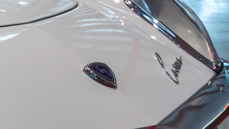
Speaking of motors, the design of one of the automaker's most famous engines helped influence the design of its logos, too. Mazda is well-known for its rotary-style engines that rely on triangular rotors instead of pistons for combustion. The so-called "Reuleaux" curved-triangle shape became the frame for Mazda's "m" logo with the Mazda Cosmo coupe, a rotary-engined sports car that first went on sale in 1967.
And lest you think Mazda only focused on logos with letters, let's take a peek at Mazda badging in the early 1990s. That's when Mazda introduced a purely graphic badge where two "wings" are raised to the point that their tips meet, creating a circle that was supposed to represent the shape of the sun. Although it had to be modified so it wouldn't look as much like the Renault logo of the time, this badge is notable for appearing on the final few years of the first-gen Miata — which is certainly a great choice for your dream summer convertible.


