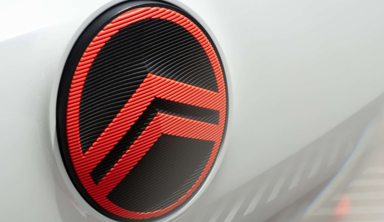
Citroën has unveiled a fresh brand identity, rooted deeply in its origins yet boldly stepping into the future. The new logo pays homage to the company's original 1919 design, featuring the iconic “deux chevrons” contained within a smooth vertical oval frame. This updated emblem is designed to be more prominent and instantly recognizable, signaling Citroën’s evolution into a more modern and dynamic brand.
Alongside the revamped logo comes a refined color palette, bringing back heritage hues like Monte Carlo Blue and introducing a vibrant Infra-Red for a fresh and energetic contrast. The company’s new tagline, “Nothing Moves Us Like Citroën,” emphasizes the brand’s passion for innovation and emotional connection extending beyond vehicles to the entire customer experience.
Citroën CEO Vincent Cobée highlighted that this transformation is more than skin-deep. It marks a significant step as the brand embraces electric mobility and renews its commitment to delivering affordability, audacity, and customer well-being. The new identity will roll out across concept vehicles and production models, manifesting in everything from the cars themselves to dealerships and digital touchpoints.
Global Brand Designer Alexandre Revert explained the design's delicate balance between the precise, technical chevrons and the warm, inviting oval, reflecting Citroën’s mission to mix heritage with forward-thinking vision. Laurent Barria, Marketing Director, reinforced the brand’s intent to challenge traditional auto industry rules, offering daring solutions that are accessible and emotionally resonant.


